Websites are the front page of any brand and are consistently one of the top most important metrics for measuring content marketing strategy. And yet so many teams struggle to build organic content experiences that get consistent results.
After hearing feedback from our sales team, and many talks with the product and product marketing team, we uncovered a big gap in our own content experience.
You see, Siteimprove is a powerful platform that offers 7 products which are packaged into 3 different solutions. It can do so much for so many kinds of marketers and roles in the organization that it can be difficult to describe what it does in a handful of sentences.
So, our team set out on a journey to optimize our website messaging using our tools, and, more importantly, the in-house expertise at our disposal.
The objective was deceptively simple: increase conversions on our site by making clear user journeys to suit our marketing personas.
What was working (and what wasn’t)
In some ways, our team had a head start in this web optimization game. Our website’s speed and loading performance weren’t an issue. And our accessibility scores are the highest they’ve ever been (shoutout to our web team who are pros at using Siteimprove’s tools to keep siteimprove.com in tip top technical shape).
But our goal was to get conversions up, so we had to figure out how our visitors were engaging with our web content, and what the best path to conversion looks like for us.
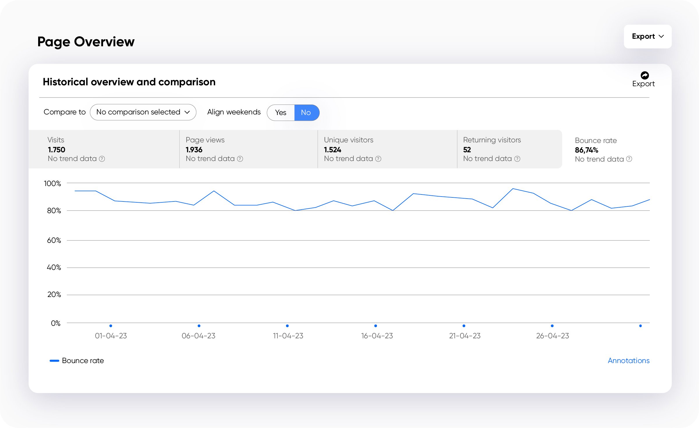
To start, we put together a marketing dashboard. This covered everything from paid and organic traffic sources from the previous month and the current month. It also tracked our top 10 visited pages from the previous month and the current month.
Our top page was, unsurprisingly, our home page. Also in our top 10 were our website checkers, which we also expected since that is top funnel content that we promote regularly. Our Ole Reliable, if you will.
But then, there were the pages we didn’t expect to see. Outdated landing pages created for solely SEO keyword purposes. This was a problem. These pages were leftovers from previous SEO projects. They weren’t optimized for our new brand design or messaging. They didn’t send our visitors down the right path. And, worst of all, they didn’t add value.
And of course, they were driving our bounce rate up.

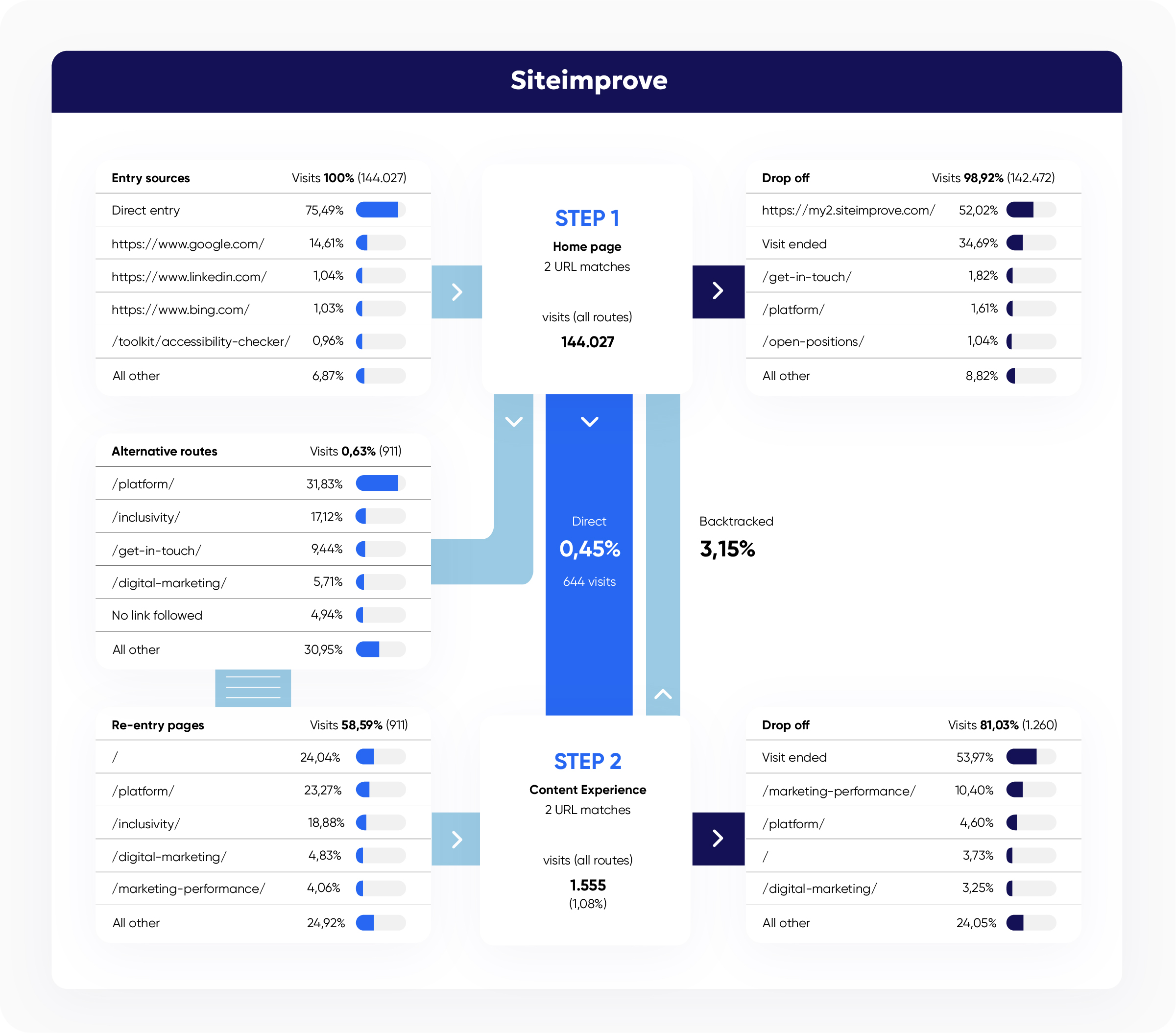
Our initial dashboard also included a funnel view of traffic from our home page to our product solution pages. Seeing the numbers laid out like this also helped us quickly realize we had a leak (ahem, several leaks) in our funnel.
From our home page to our Content Experience solution page, for example, there was a major drop off in traffic. Not all of it was bad. Some of the traffic was heading to other key pages, but around 30% were simply leaving the page.

And there seemed to be no consistent patterns. Visitors were wandering around our website without a clear direction of where to go next. We could see that people seemed to like our website checkers, again, no surprise there. But they were not finding the valuable information about our products and their benefits that could help them make a decision.
That was totally on us. But now we could see where the leaks were and we could go about setting it right.
Build it and they will come…right?
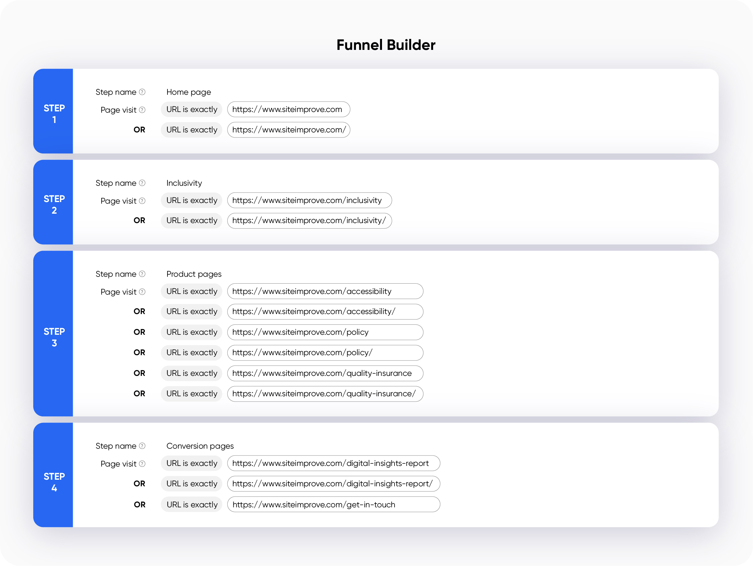
Using Siteimprove’s Funnel Builder, we mapped out the three conversion paths we wanted to track. Each of these paths would lead people to the different solution packages we offer: Inclusivity, Content Experience, and Marketing Performance. From there, we plan to take people to relevant product pages, showcasing the usual content touchpoints, like customer stories, videos, you know the drill.

Once we had our ideal conversion path clearly mapped out, we could get to work.
We needed to keep the user experience at the front of our minds and think about how we could solve our users’ problems across the journey. The less value they find, the more likely they are to bounce.
We’d already invested a lot of time and effort into creating highly detailed, granular-level personas. Each one with its own personalized messaging that was designed to hit home and help our copy add value.
The focus was on outcomes and what you could get out of the Siteimprove.ai platform.
So, we updated the copy on the home page, three solution pages, and our three key conversion pages to make it ultra clear which solution a brand needs for each kind of goal: Are you looking to manage a website and stay compliant? Do you need to dig deeper into your content analytics and optimize to convert? Or do you need one central place to house all your marketing metrics across landing pages, ads, and SEO?
We also had to be realistic about what we could achieve in a short amount of time with the resources we have. The pages we updated aren’t the entire journey, but it’s a strong start and the pages we chose to optimize first are heavy hitters that will tell us a lot as we continue to track them weekly using the funnel and user journey tools in Siteimprove Analytics.
Marketers in progress
Let’s be clear. I’m not a number cruncher. Data analyst blood does not run through these veins. But there’s something about these funnel views that fascinate me. I’ve always been on the creation side of copy. And if I was lucky, the team had a data analyst on hand to supply us with some metrics on how our content was performing.
So what's next for our team? Along the way, we realized that what was missing was a way to compare our 'before' against the 'after,' which actually inspired our newest feature, Funnel Comparison. We plan to use it to compare our funnels against two different time periods and be able to see changes in our funnels (and hopefully an increase in our conversions). It’s just one of the exciting new features from our Q1 2024 product release.
The work is far from over, but I feel much more confident about it now than I did 2 months ago. We have a path mapped out and are working to build and measure that path. Is this the right path for our visitors? We’ll let the numbers tell us as we continue testing and tweaking.

Jessica Navarro
As part of Siteimprove’s Global Content team, Jessica has written extensively on web accessibility. She has a knack for taking big complicated information and ideas and whittling it down to something nice to chew on. Jessica also likes to get to the core of things and understand how things work and how people think.
